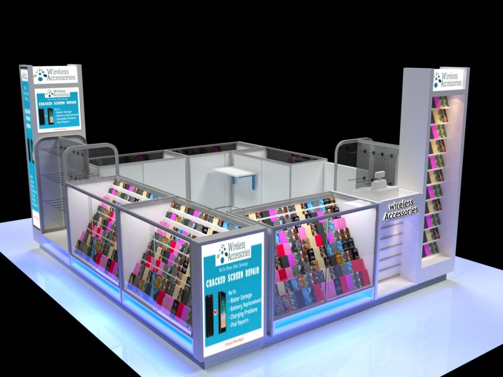
This is the cell phone kiosk you can see but have you ever thought about how it was designed?
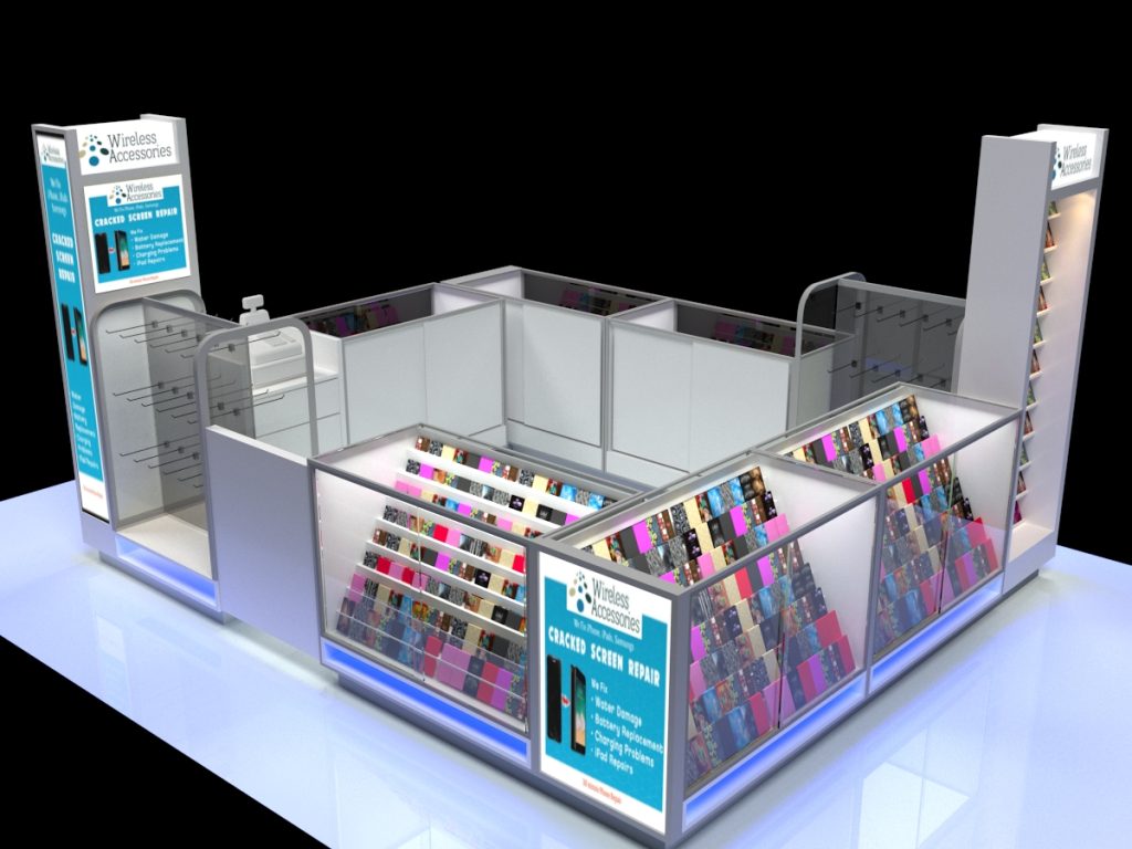
Appearance & Color Scheme
The main structure uses a clean gray-white palette to create a modern, professional visual tone. Blue lightbox ads provide color contrast, highlighting repair services while reinforcing brand recognition through bold visual accents.
Display Structure Design
- Multi-Layer Shelving Combo: Surrounding open shelves and glass cabinets allow customers to directly browse and access phone cases, with glass cabinets protecting premium or featured items.
- Zoned Display: The kiosk organizes cases into distinct color and style categories, strategically balancing visual variety with intuitive order to help customers browse effortlessly and accelerate their selection process.

Advertising & Messaging
Pillar and cabinet lightbox ads feature the “Wireless Accessories” logo alongside service labels like “Repair Phones, Tablets, Samsung Devices” and “Cracked Screen Fix.” This integrates case sales with repair services, promoting a “accessories + service” business model.
Functional Space Planning
Keep the central staff zone for cashier operations, repair consultations, or temporary storage. This creates a clear “display (perimeter) – service (center)” functional zoning, ensuring smooth customer browsing without disrupting staff workflow.
Lighting & Atmosphere
Shelves include built-in lighting to highlight case colors/details. A blue LED strip at the base adds a tech-savvy ambiance, complementing the sleek design for a modern, trendy vibe aligned with electronics accessory retail.
The kiosk uses a gray-white base with blue accents and logos for a clean, professional yet eye-catching look. Open shelves and glass cabinets sort products into color-coded zones, helping customers quickly find items. The outer ring lets shoppers browse freely, while the central area boosts staff efficiency. Shelf spotlights highlight product details, and blue base LED strips add tech flair. Ads link phone case sales to repair services (e.g., “Cracked Screen Fix” next to cases) to naturally encourage additional purchases.
This design balances visual appeal, organizational efficiency, and service promotion – perfect for a phone accessory store!