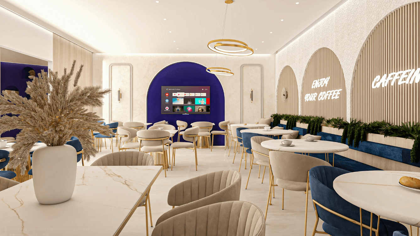

In the field of commercial space design, every detail embodies the designer’s ingenuity and craftsmanship. A successful store design must not only captivate visually but also be deeply considered from multiple dimensions, such as customer experience and brand communication. Take the store named “København” before us, for example. Its design demonstrates unique charm and professional excellence in many aspects, making it worthy of in-depth analysis.
Color Palette
The color scheme of this store is highly distinctive. The primary hue is a striking red, which has a strong visual appeal, quickly capturing customers’ attention and sparking curiosity. Red is not only a vibrant and passionate color but also creates a warm and welcoming atmosphere in commercial spaces, encouraging customers to step inside and explore.
Complementing the bold red are warm wooden tones, seen in the flooring and some of the wooden display shelves. These natural hues bring a sense of comfort and earthiness to the space. The combination of warm and cool tones is masterfully executed: the vibrancy of red is balanced by the warmth of wood, preventing the red from feeling overly aggressive or overwhelming while ensuring the wood tones don’t appear dull. This harmonious balance creates a space that is both energetic and inviting, striking a perfect visual and psychological equilibrium.

Spatial Layout
The store follows an open-concept layout. The entrance is spacious and unobstructed, allowing customers to easily view the main areas of the store upon entering. This enhances the sense of transparency and openness.
Inside, the central area features small round or square tables and chairs arranged in a casual, asymmetrical manner, creating a relaxed atmosphere suited for a leisure-oriented establishment. Surrounding this seating area are product displays, seamlessly integrating shopping and experiential spaces. This setup encourages customers to browse and purchase items while enjoying their time in the store.
The operational area at the back is subtly separated from the front retail and seating zones but remains visually connected through the open design. Customers can observe the beverage preparation process, adding transparency and interactivity to their experience while optimizing the store’s spatial efficiency.
Lighting Design
Lighting plays a pivotal role in the store’s design. Externally, the white illuminated lettering of the store’s name stands out vividly against the red backdrop, ensuring clear visibility from a distance. Linear lighting around the signage outlines the store’s façade, adding depth and dimensionality.
Inside, the lighting is equally meticulous. Recessed ceiling lights provide uniform ambient illumination, ensuring the space is well-lit. In product display areas, focused spotlights highlight merchandise details and textures, enhancing their appeal and drawing customer attention. The seating area features softer lighting with shaded fixtures, creating a cozy and intimate ambiance that encourages customers to linger and socialize.

Merchandise Display
The product displays are thoughtfully designed with a layered approach. Open shelving along the walls showcases a variety of items, making it easy for customers to browse and pick up products. Labeled signage above the shelves categorizes and describes the merchandise, aiding quick navigation.
In the central area, islands of varying heights break the monotony of traditional arrangements. These displays feature promotional or signature items, strategically placed to catch customers’ attention as they move through the store. The islands also serve to guide customer flow, ensuring maximum exposure to the store’s offerings.
Decorative Elements
The store’s decor further elevates the overall design. Potted plants in the seating area introduce a touch of nature, adding vitality and improving the micro-environment. The organic forms of the greenery contrast beautifully with the man-made surroundings, creating a refreshing atmosphere.
Wall art and posters related to the brand’s products or identity reinforce the store’s messaging and ambiance. These elements add visual interest to the walls, preventing large monochromatic surfaces from feeling sterile while communicating the brand’s culture and uniqueness.

Conclusion
In summary, this store’s design reflects careful consideration and harmonious integration of color, space, lighting, displays, and decor. Each element works synergistically to create a visually striking yet comfortable retail environment that effectively attracts customers and enhances their shopping experience.
Retail Display
Exploring More Interesting Ideas